paulrobertlloyd
paulrobertlloyd

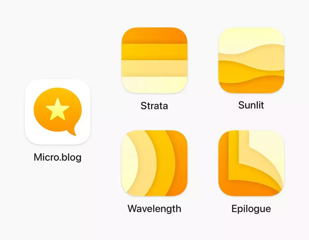
The release of @manton’s new notes app got me thinking about the icons for these different companion apps, and how they might look if they were designed to appear more like a family.

Too closely related? Possibly, but there’s something in this, I think.

The current iOS icon for Micro.blog, sat alongside 4 alternative icons for Strata, Sunlit, Wavelength and Epilogue. All icons share a yellow colour palette and feature overlapping shapes.
|
Embed
BWLNG
BWLNG

@paulrobertlloyd Nice work, these look great.

|
Embed
numericcitizen
numericcitizen

@paulrobertlloyd great work!

|
Embed
adamprocter
adamprocter

@paulrobertlloyd @manton they look great but we need a similar wave thing for micro.blog app. - in terms of similarity I would have to have them on my phone to see if I got confused happy to test

|
Embed
adam
adam

@paulrobertlloyd this is love at first sight for me — wonderful work.

|
Embed
In reply to
manton
manton

@adamprocter @paulrobertlloyd I want to keep the Micro.blog app icon as it is. All the icons still fit together, but it makes sense to me that the main app icon is distinct from the companion apps.

|
Embed
otaviocc
otaviocc

@paulrobertlloyd @manton the apps look awesome. But I'd swap the Sunlit and Wavelength ones.

|
Embed
ridwan
ridwan

@paulrobertlloyd Love these icons. Brilliant 🤩

|
Embed
thedimpause
thedimpause

@otaviocc I like that the Wavelength sound waves and Sunlit light waves are shown as the correct type of waves 🙂

|
Embed
adamprocter
adamprocter

@manton that makes sense.

|
Embed