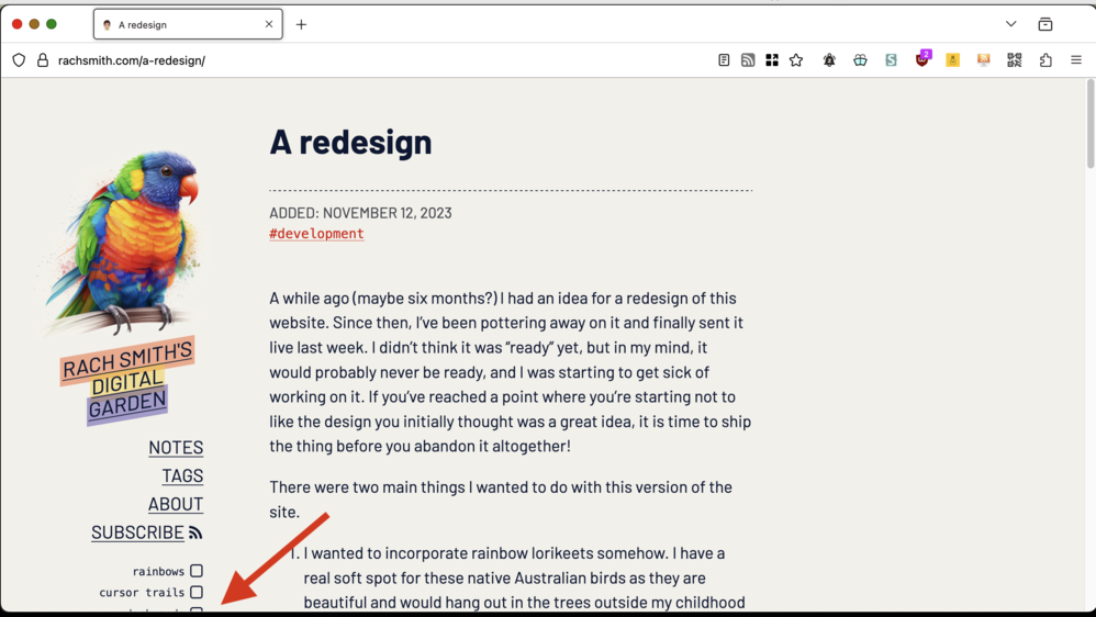
moved a few things around and gave the site a new lick of paint rachsmith.com/a-redesig…
@rach Saw this in my RSS feed and of course I had to see it live on the actual site. It looks great!
@rach looks incredible! Can’t wait to read more about your commenting solution!
@rach the down scroll wheel doesn't work for me, and also the mouse effect prevents me from using the scrollbar (Mac, firefox) just letting you know.
It looks beautiful though
@eric thanks! I was surprised at how many people ended up on the site just after posting to RSS, it’s usually a mystery as to how many people are reading via RSS
@llimllib oh I see now, it scrolls if your cursor is on the content of the page, but not if your cursor is in the space to the right of it (on a big screen) I’ll see what I can do!
@davatron5000 it all started with the birb
@rach The content at the bottom of the sidebar is cut off for me. You could use a vertical media query to un-stick the sidebar at smaller viewport heights.

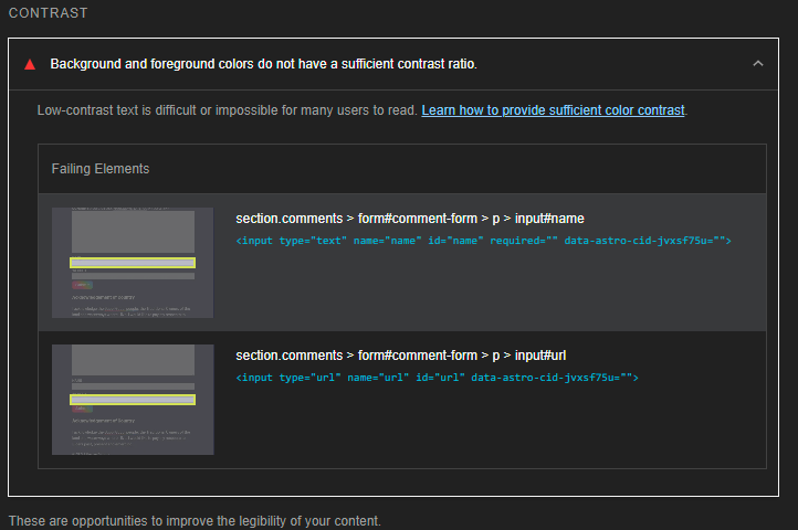
@rach <pedantry> Lighthouse complains that your form inputs lack sufficient contrast in dark mode
