jarrod
jarrod

🔗 PayPal has a new logo that makes it look just like everything else // Sean Hollister // theverge.com

Roughly 25 years after it launched payment processing, PayPal is “ushering in a new era for customers” with some generic black text. The company has a new logo, designed by Pentagram, that looks incredibly plain — especially compared to previous iterations of the logo that featured a rakish slant, two shades of blue, and prominent PayPal P’s.

Yikes. Really lost all its flavor and personality here. I wonder when this trend will turn around.
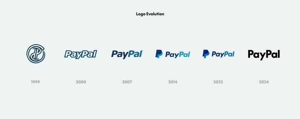
PayPal logo evolving from 1999 to 2024 against a light background. The progression starts with a stylized “P” and transitions through various “PayPal” text designs, with increasing simplicity over time.

|
Embed
Progress spinner
jarrod
jarrod

@alexandra Probably so! I’d have given them a better price. 😜

|
Embed
Progress spinner
manton
manton

@jarrod The actual graphic version of the logo looks pretty nice on their web site. They should’ve kept the color in the text-only version, though.

|
Embed
Progress spinner
crossingthethreshold

@jarrod I was going to try and outbid you 😆 @alexandra

|
Embed
Progress spinner
In reply to
odd
odd

@jarrod I like the 2007 version better. I only use PayPal when it’s the only way.

|
Embed
Progress spinner
lmika
lmika

@jarrod Hope they didn’t pay too much for this brand refresh. If it’s a logo that I can design… 😂

|
Embed
Progress spinner
numericcitizen
numericcitizen

@jarrod WTF, it’s not a logo…it’s a bunch of letters tied together into a… word. 🤦🏻‍♂️

|
Embed
Progress spinner