
Continuing to improve the Logs page in Micro.blog. I think the color for different tasks helps. Still a little nerdy, but it’s a very useful page to understand what Micro.blog is doing.
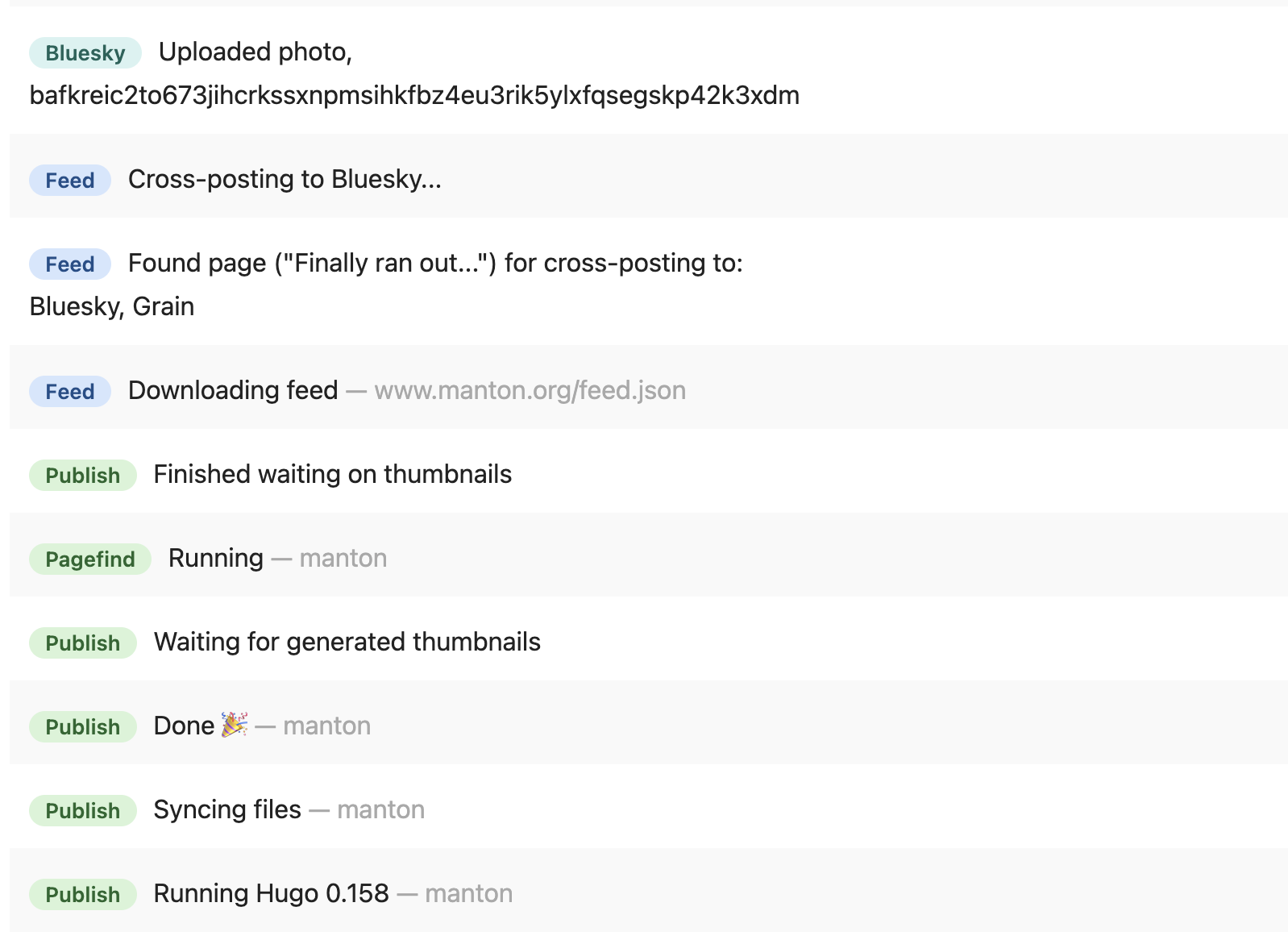

Continuing to improve the Logs page in Micro.blog. I think the color for different tasks helps. Still a little nerdy, but it’s a very useful page to understand what Micro.blog is doing.

@manton the colors look ok to me but consider running the palettes you use thru a tool to check how people with various colorblindness will see them - often shades of colors that people with regular color vision easily can tell apart (like the yellow and green on every Mac window) look identical or very hard to tell apart for folks like myself with some form of colorblindness. When color is conveying important information this can be a source of frustration.
(The text differing helps)

@manton Indeed, it is helpful. I was working a project or two and I checked logs today. That when I saw new changes. I can see it clearly what it is doing! Thanks.

@manton I agree the logs page is very useful. It shouldn’t be buried under the account page. Should be on the main navigation menu. :)
@unattributed Yeah. There are so many things in the menu I worry about adding more. If you’re on a computer, a shortcut I use is: press the “/“ key, then type logs.
