🧵 iOS 17 (et al.) Beta Impressions Thread:
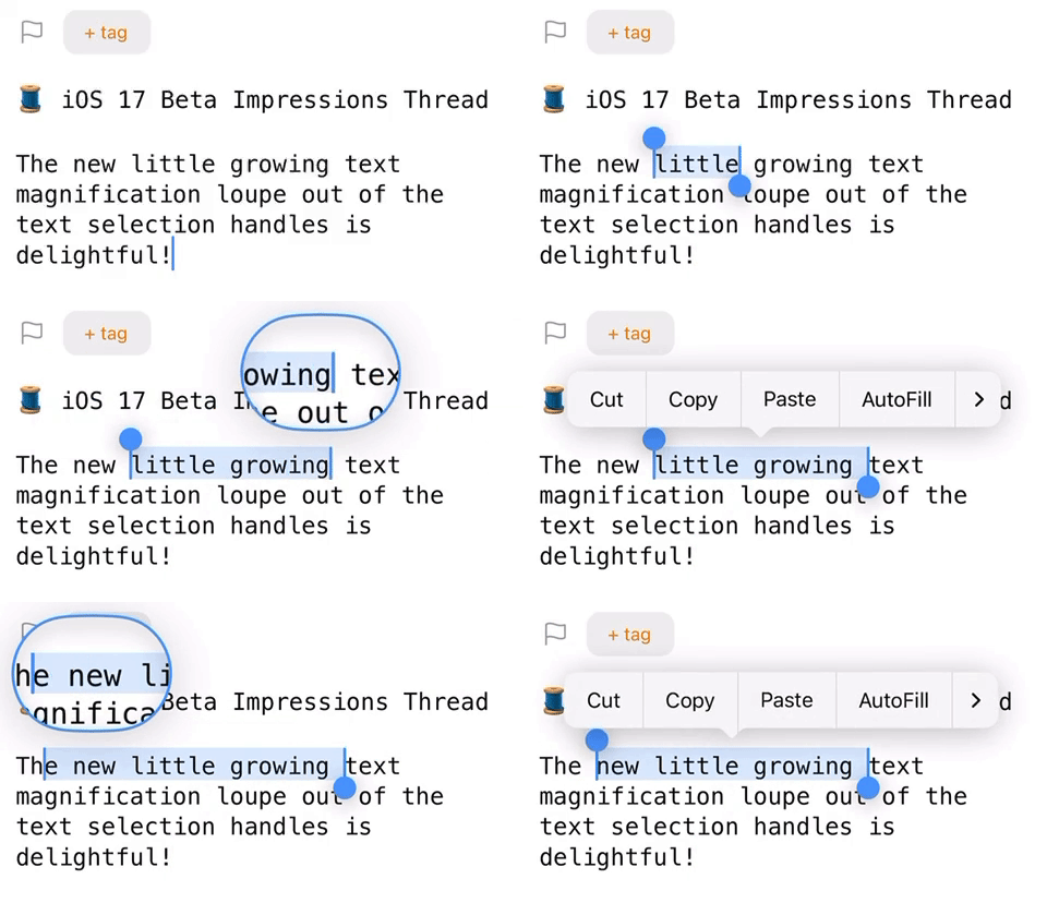
The new little growing text magnification loupe animating out of the text selection handles is delightful!
🧵 iOS 17 (et al.) Beta Impressions Thread:
The new little growing text magnification loupe animating out of the text selection handles is delightful!

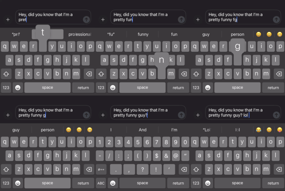
@jarrod Hallelujah! Autocorrect finally ditches capital “L” for ”lol” even when it’s the first word in a sentence.
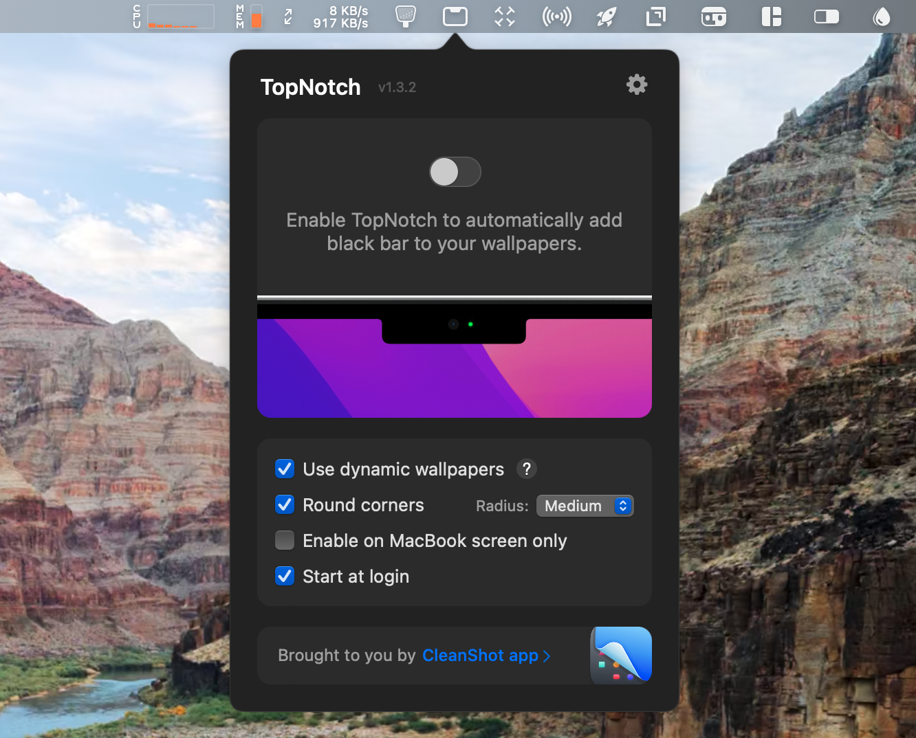
@jarrod The beautiful new live landscape wallpapers/screen savers might make me give up my beloved TopNotch app. TopNotch has to adapt to the wallpaper below to make it work, and since the wallpaper is different every time… 😱
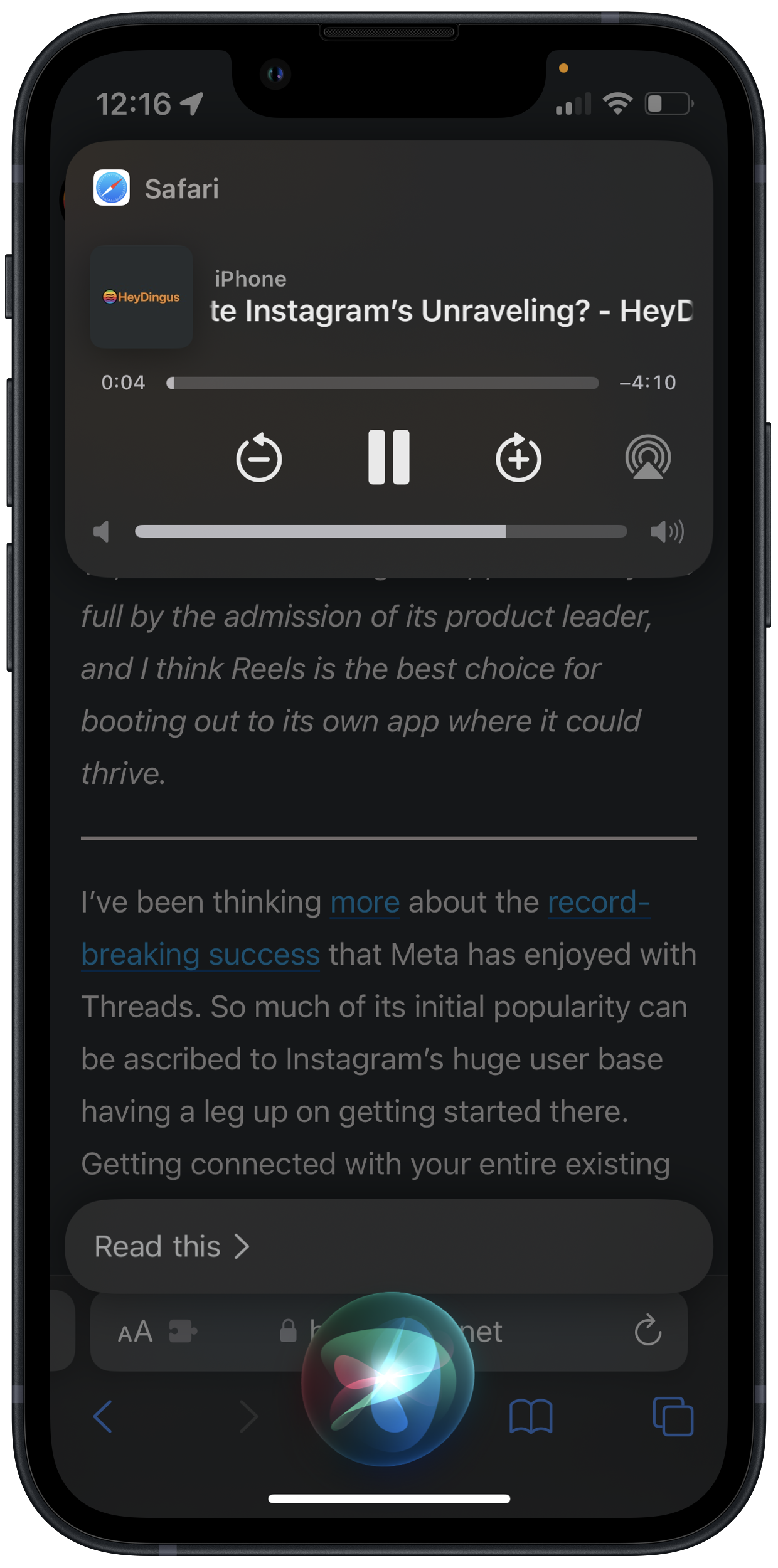
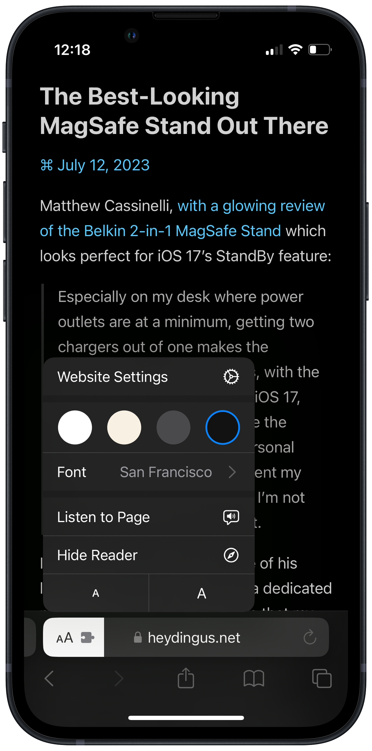
@jarrod Listening to web articles has never been easier! Tell Siri to “Read this” and it will pull up a custom Now Playing UI complete with the article’s hero image. Or pull it up in Safari Reader and you get a new ‘Listen to Page’ button.
@kq It’s been fun to play with so far! I waited until the official release last year – this year I was too excited.
Having this screen capture menu bar item active all the time is kind of annoying. Ironically enough, Bartender cannot hide it for me.

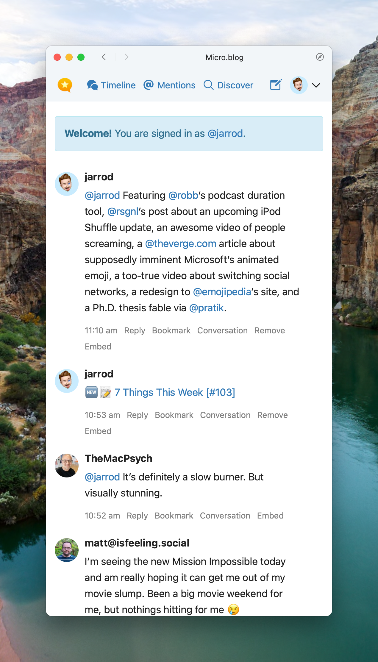
Adding sites as web apps is not a new concept, but is pretty great in macOS Sonoma. I’ve only got one for Micro.blog for now, but I really like it. I find it better suited for what I do than the regular Mac app, and keeps it out of my Safari window where I’m more likely to get distracted.
@jarrod That is really cool. I think I’m looking forward to web apps in Sonoma more than anything else.
@manton It gets two big thumbs up from me! I’d love to see some of the things you and @danielpunkass suggested on @coreint, but so far so good.
@jarrod This is very encouraging to see. I plan to switch to this as well in Sonoma since the Mac app isn’t the best experience for Micro.blog
@jarrod @manton @pratik I just added a second one for ImageKit.io which I use as a CDN for my main blog. Since I usually want to reference it alongside something else, I think it’ll be another good use case. And hopefully stay logged in better than their website. 🙄
I don’t know if this is a Sonoma thing, but macOS’s text replacement setup screen is much clearer than the one on iOS. I always type the wrong one first on iOS.

@jarrod You know how for the last year iOS would surface great photos for your Lock Screen, but faces were inevitably obscured by the time? That’s fixed in iOS 17! Looks like it’s doing a clever mix of mirroring, blurring, and gradient darkening to extend the top of photos for faces to be unobstructed.