pcora
pcora

Calling for CSS specialists here, if you know any, please tag. I’m using @Mtt theme and I wanted to make photos on the iPhone go full width instead of having some margin. Any clues how to get there?
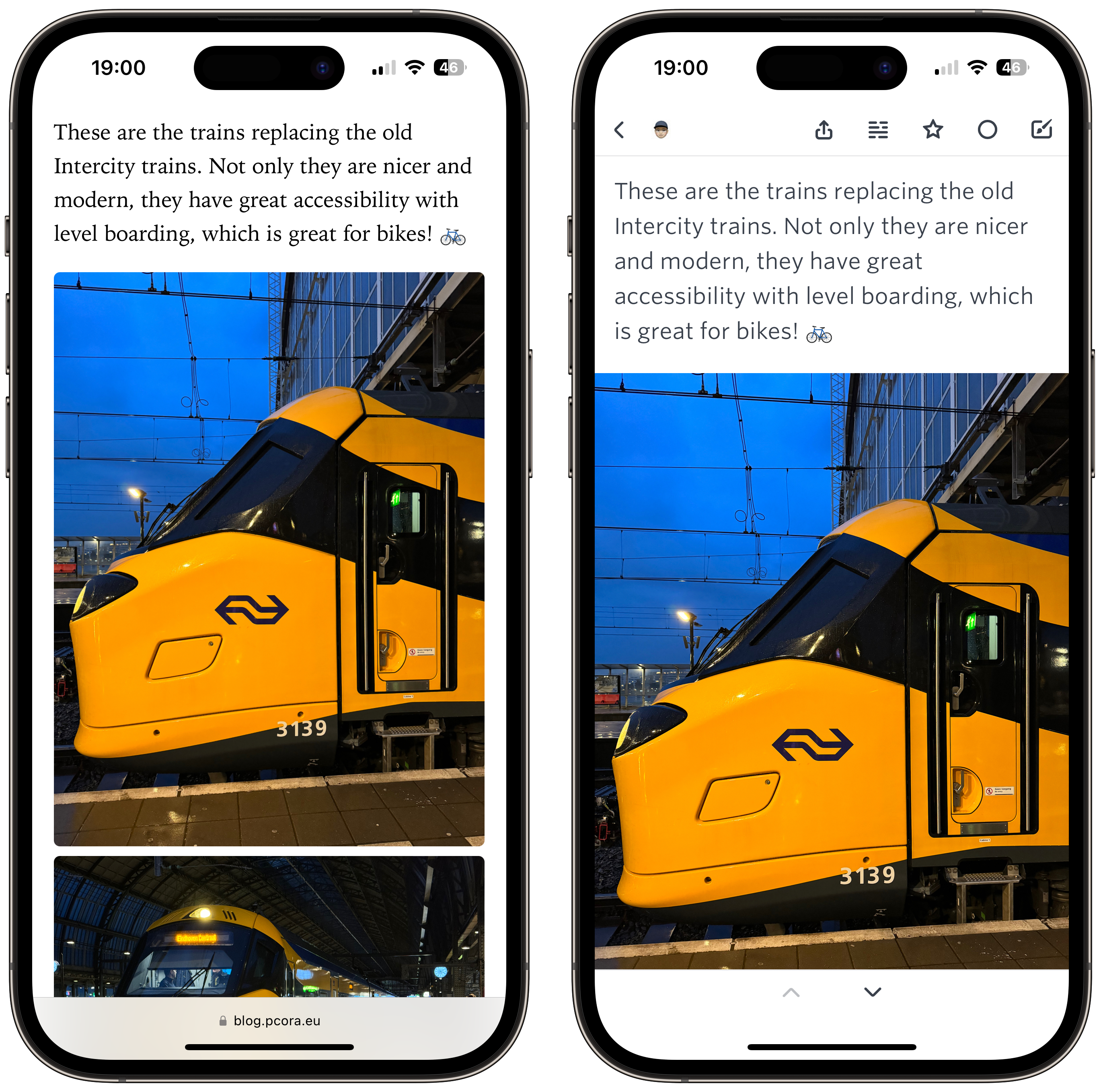
Screenshot showing two iPhone images with my blog post in the background.
|
Embed
Progress spinner
pratik
pratik

@pcora Commenting so I know about this too.

|
Embed
Progress spinner
maique
maique

@pcora Same as @pratik 😅

|
Embed
Progress spinner
jsonbecker
jsonbecker

@pcora I've looked into full-bleed a few times, only to realize I'd have to rearchitect my theme quite a bit since it's very hard to "break out" of a container. It may not be feasible (not an expert, and not an expert on this theme).

|
Embed
Progress spinner
Mtt
Mtt

@pcora There is a way. 😉

I’ll get that to you soon.

|
Embed
Progress spinner
In reply to
Mtt
Mtt

@pcora Try this.

article img, .e-content img, .p-summary img {
width: 100vw;
height: auto;
border-radius: 0;
position: relative;
left: 50%;
right: 50%;
margin-left: -50vw;
margin-right: -50vw;
}

That will give you full-width images on every browser and device. You could use a media query to target smaller screens. (cc @pratik, @maique, @jsonbecker, @mikehaynes). This works on many themes.

|
Embed
Progress spinner
maique
maique

@Mtt Thank you. Already searching for “media query smaller screens” 🤓

|
Embed
Progress spinner
pcora
pcora

@Mtt thank you!! I will give it a try. But if I want only on small screens, then I need a media query, right?

|
Embed
Progress spinner
Mtt
Mtt

@pcora Yes, media query required. You could set it for a pretty high max width though.

|
Embed
Progress spinner
Mtt
Mtt

@maique It’s a simple wrapper you can put around a bit of CSS to make it only apply to certain screen sizes and such.

|
Embed
Progress spinner
maique
maique

@Mtt Thanks 🙂 I had looked it up already. Waiting for this whole weekend to be done with, and will try that 🙂

|
Embed
Progress spinner
maique
maique

@Mtt Tried

@media screen and (max-width: 1290px) {
  article img, .e-content img, .p-summary img { width: 100vw; height: auto; border-radius: 0; position: relative; left: 50%; right: 50%; margin-left: -50vw; margin-right: -50vw; }
}

Strangely the images were showing up left aligned. Hmmm…

|
Embed
Progress spinner
Mtt
Mtt

@maique Your code above is missing a semicolon.

I’ll be at a computer later tonight and can have a look specifically at your site.

|
Embed
Progress spinner
maique
maique

@Mtt No worries, thank you 🙂 I’ll get to the bottom of this one.

|
Embed
Progress spinner
Mtt
Mtt

@maique Had a second, so had a quick look. Your images have an inline max-width: 100%; applied to them. That will either need to be removed or overridden. If you add max-width: none !important; to the code I sent, it'll override it.

Removing that line in your posts is ideal, but that could be an insane amount of work depending on how it was originally done. The over-ride works fine.

|
Embed
Progress spinner
maique
maique

@Mtt Thanks. I was having trouble figuring this out, and thought the glightbox plugin might have something to do with it. When I uninstalled it, your code seems to work. Turning it back on ruined it again.

This last line you sent does the trick, much appreciated. Now I just have to see if I get used to it, I like what you did with images in the theme, so…

|
Embed
Progress spinner
vincent
vincent

@maique Wow, those images are HUGE now on desktop 🤣

|
Embed
Progress spinner
maique
maique

@vincent Oops!!! Wait, turning it off.

|
Embed
Progress spinner
vincent
vincent

@maique I think if it kicks in on mobile, then it'll be ace... or up to a certain width.

|
Embed
Progress spinner
maique
maique

@vincent I believe it was 1500px tops, but then it had an incompatibility with the lightbox plugin, so had to add a line I believe screw that up. No biggie 🙂 Too late to be doing this anyway.

|
Embed
Progress spinner