manton
manton

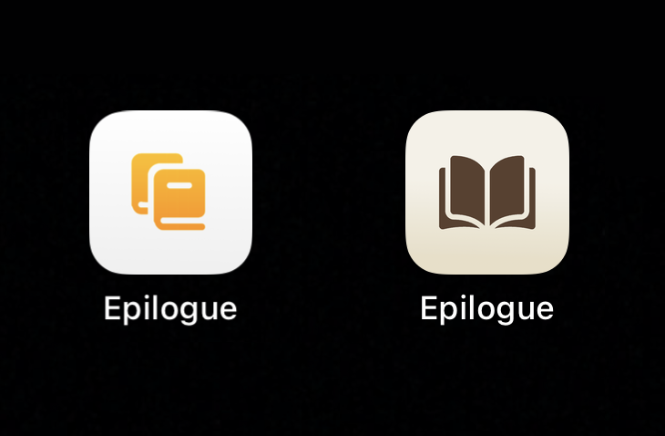
The icon for our app Epilogue has bugged me since I whipped it together for version 1.0. I should probably get a real designer to make a new one, but I spent a little time this week coming up with a new one that I like. Old on left, new on right. Goodreads-inspired colors.

Epilogue icons
|
Embed
Progress spinner
shep
shep

@manton Looks great!

|
Embed
Progress spinner
manton
manton

@shep Thanks!

|
Embed
Progress spinner
amit
amit

@manton That’s a huge improvement. Even if you don’t get a real designer, this should work well :)

|
Embed
Progress spinner
paulrobertlloyd
paulrobertlloyd

@manton I quite liked the ‘e’ looking shape in the previous icon… actually wondered if it might have been intentional.

|
Embed
Progress spinner
In reply to
Gabz
Gabz

@manton ❤❤❤❤❤

|
Embed
Progress spinner
BenSouthwood
BenSouthwood

@manton It looks much better.

|
Embed
Progress spinner
iChris
iChris

@manton Definitely triggers more of a book response to me in the new version.

|
Embed
Progress spinner
laura
laura

@manton As ‘epilogue’ usually implies something at the end of the story or book, I kinda want to see the book not open to the middle page, but to the end page.

|
Embed
Progress spinner
lukebouch
lukebouch

@laura that’s a great idea 💡

|
Embed
Progress spinner
laura
laura

@lukebouch Thanks! I drew a scribbled version here: laura.micro.blog/2022/08/2…

|
Embed
Progress spinner
Sylari
Sylari

@manton Looks more bookish. First trial of Epilogue has worked nice and smooth.

|
Embed
Progress spinner