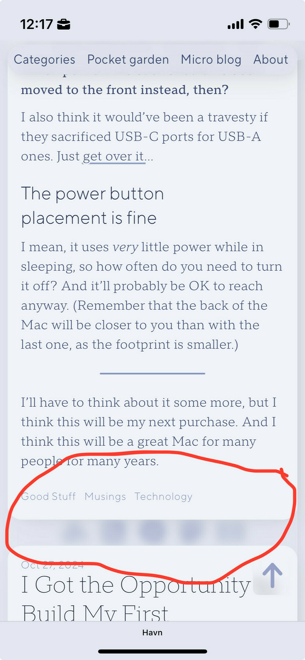
@Havn great (but laggy) design (on M2 MacBook Air, using Arc Browser).
@numericcitizen Yeah – there's something specifically wrong with Chromium browsers! I want to look into this today – so I made this post to test with, to make sure I don't break anything else. ☺️
Could also be an excuse to improve the performance on my site in general, heh. And thanks for the comment, so I can test the looks of those as well! 😁
(Slightly unrelated: If you haven't already, I recommend checking out Zen! And not only because my blog currently works better in it. ;) )
@Havn Love it but yeah, laggy on Arc but smooth on Safari. I love your fonts. Can you share what you are using?
@pratik @Havn@micro.blog Thanks!
I found the culprit: Chromium doesn’t like it when you use a lot of drop-shadows. I simplified the image shadows now, and it’s much better. Still have a bunch of optimisation to do, though!
Glad you noticed the fonts! I spent more than I should on licences for TT Norms, from TypeType. 🙈
@havn@mas.to @Havn@micro.blog Much better. Although the ghost of the footer appears briefly at the bottom of the page when you scroll.
@pratik @Havn@micro.blog Aha, yeah. That’s due to Chromium not being able to keep up with something, and how the footer works. I think the idea is neat — but more performance minded people will cringe 😁:
The footer is always there, beneath the «glass» — you can see it between posts when you scroll down on the front page. (Image 1) And then it gets revealed when you get to the bottom. (Image 2)
(1/2)


@pratik @Havn@micro.blog The thing with shadows, is that they look the best if you have many of them — but it hurts the performance. Especially in Chromium, and especially when it’s the type that also works on partially transparent images.
I should prioritise performance more!
(2/2)
@havn@mas.to @Havn@micro.blog Ah! In that case, it's fine. Maybe on Chromium, the effect is choppy so it feels like a bug more than a feature.
@pratik Nah, it _is_ a bug the way you’re experiencing it!
The footer is always there, and so is the “glass pane” above it. But the glass pane ends when the visitor is supposed to see the footer. However, you’re supposed to see neither while scrolling a blog post – but when Chromium struggles with the rendering of the post, you see what’s beneath, like in your screenshot. :)
Working on further improvements now!
