jarrod
jarrod

Nick Heer: ‘On Liquid Glass’

Apple justifies these decisions by saying its redesigned interfaces are “bringing greater focus to content”. I do not accept that explanation. Instead of placing tools in a distinct and separated area, they bleed into your document, thus gaining a similar level of importance as the document itself. […] But, in my experience, the more the interface blends with what I am looking at, the less capable I am of ignoring it. Clarity and structure are sacrificed for the illusion of simplicity offered by a monochromatic haze of an interface.

A fair and cogent review.
|
Embed
Progress spinner
In reply to
jarrod
jarrod

@jarrod More on the fallacy of focusing on content as the end-all:

> Even if I bought that argument, I do not understand why it makes sense to make an application’s tools visually recede. While I am sometimes merely viewing a document, I am very often trying to do something to it. I want the most common actions I can take to be immediately obvious. For longtime Mac users, the structure of most apps has not changed and one can rely on muscle memory in familiar apps. But that is more like an excuse for why this redesign is not as bad as it could be, not justification for why it is an improvement.

|
Embed
Progress spinner
jarrod
jarrod

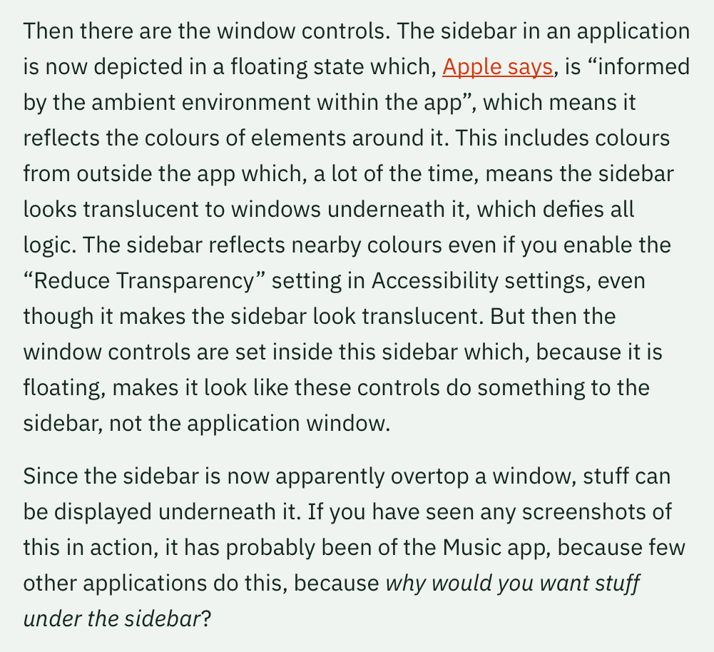
@jarrod And the sidebar/window control madness:

Image of a text discussing window controls in applications. It explains that the sidebar appears in a floating state, reflecting ambient colors, making it look translucent. The sidebar reflects surrounding colors even with “Reduce Transparency” enabled. Window controls within the sidebar appear to affect the sidebar rather than the application window. This design allows content to be displayed underneath the floating sidebar. The text highlights how this is seen in the Music app and questions the purpose of placing content under the sidebar.

|
Embed
Progress spinner
numericcitizen
numericcitizen

@jarrod This! 100%. What were they thinking?

|
Embed
Progress spinner
jarrod
jarrod

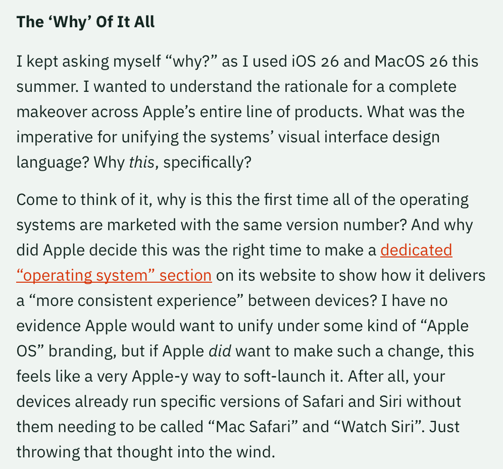
@jarrod The appleOS idea lives on:

A screenshot of text discussing Apple’s decision to unify iOS 26 and macOS 26 with a consistent visual interface. It questions the rationale behind using the same version number for different operating systems and mentions a dedicated “operating system” section on Apple’s website. The author speculates on the possibility of unifying under an “Apple OS” branding, noting Apple’s approach to consistent user experience across devices.

|
Embed
Progress spinner
jarrod
jarrod

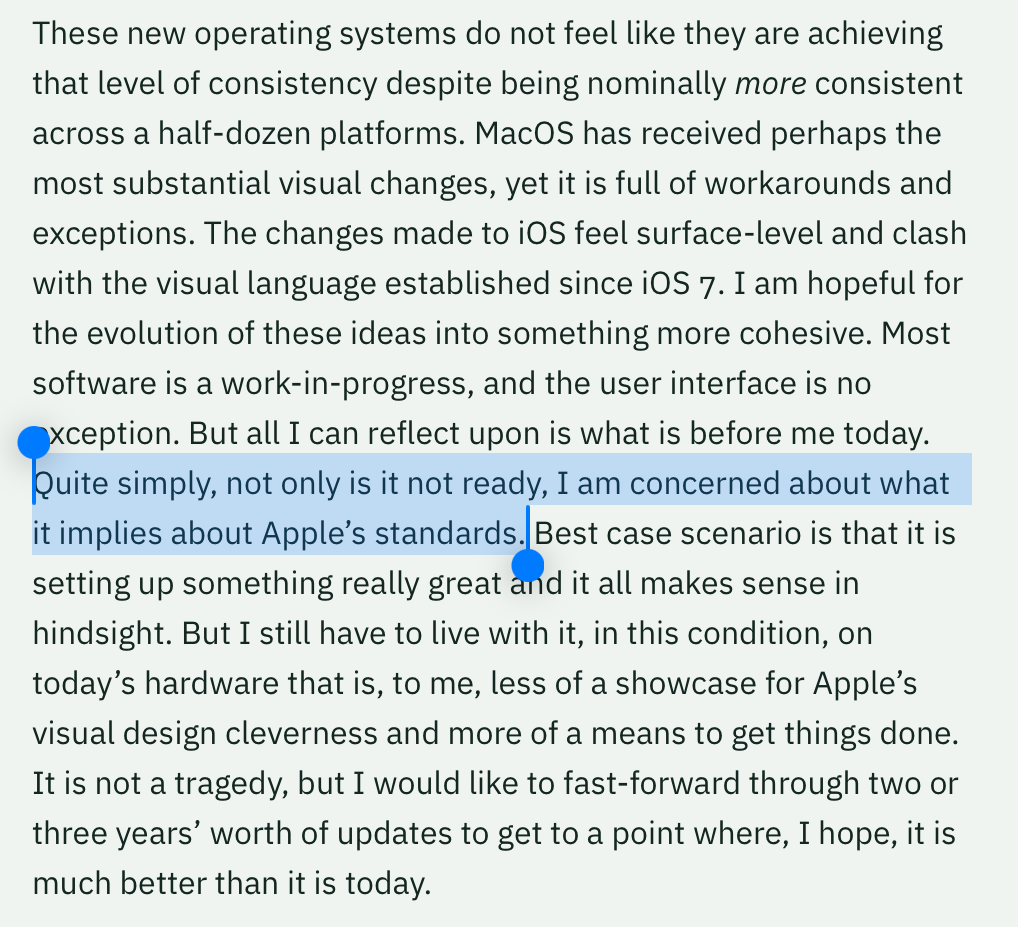
@jarrod A final quote, the conclusion that I agree with wholeheartedly:

Highlighted text in an article discussing operating systems and design consistency. The highlighted portion reads: “Quite simply, not only is it not ready, I am concerned about what it implies about Apple’s standards.” The article critiques MacOS and iOS visual changes, expressing hope for future cohesion but current dissatisfaction.

|
Embed
Progress spinner
bapsi
bapsi

@jarrod going off vibes but I think we’re all being very gently herded toward a further-future-ironed-out-and accessible AVP experience as the apple standard

|
Embed
Progress spinner
jarrod
jarrod

@bapsi let’s hope so!

|
Embed
Progress spinner