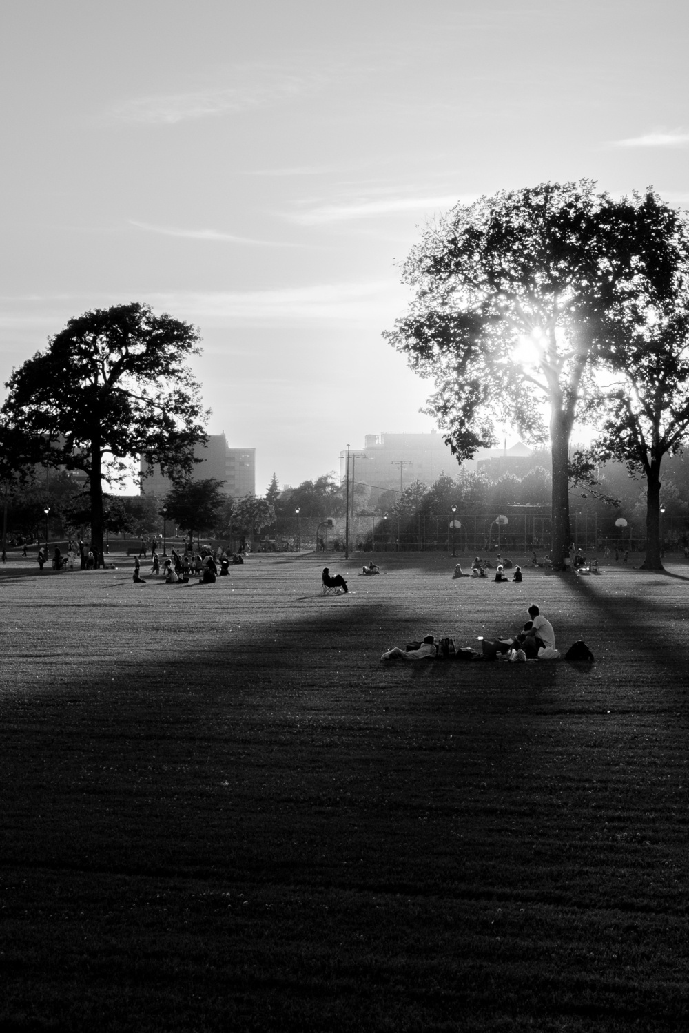
I’ve always favoured black and white, although I keep experimenting with colour.
The issue here is that I simply have different tastes from everybody around me. For example, I strongly prefer the b&w version of this photo.
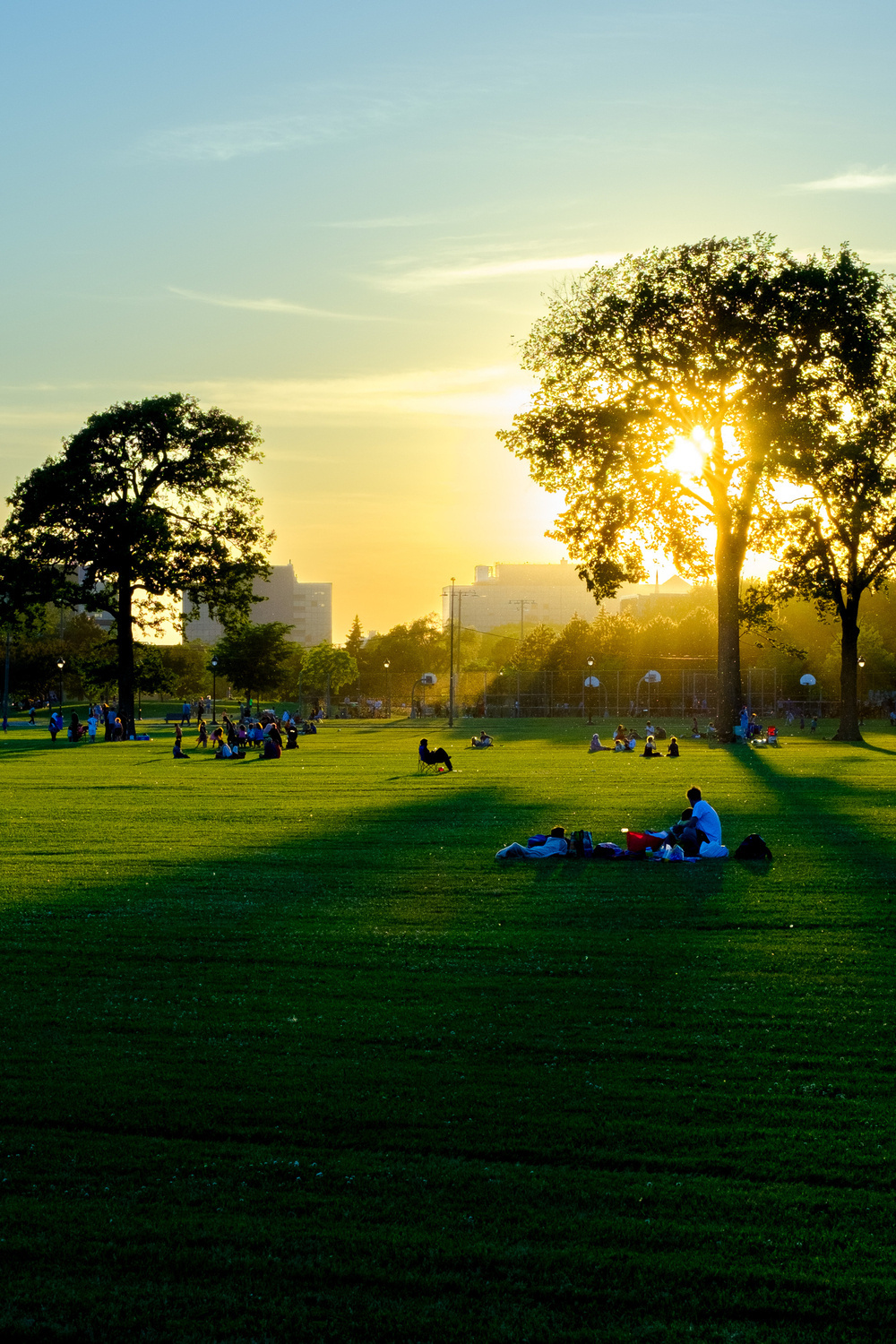
I’ve always favoured black and white, although I keep experimenting with colour.
The issue here is that I simply have different tastes from everybody around me. For example, I strongly prefer the b&w version of this photo.
@baldur I prefer the BnW too but I wonder if part of that is due to the high vibrancy in the colour version. It is easier to make out some elements in the colour one so I wonder if a more muted edit would suit it more? For example, you shared some images from Iceland a few days back including one of a horse. I think that sort of colour edit would be better. But maybe BnW is just better!
@ChrisJWilson Yeah, I had that thought myself as well. I’ve tried so many different colour edits on this photo 😅. The conclusion I came to after trying out variations was that, for this particular photo, adding even muted colour ended up downplaying the otherwise strong shapes that dominate the picture, whereas the b&w emphasises them.